
Monetary Metals Supply and Demand Report: 20 July, 2014
On Thursday, a Ukrainian rebel and/or Russian shot down a Malaysian airline. The price of gold shot up, and the price of silver spiked even more. Were we of a conspiratorial mindset, we would say it was suspicious. We would post a graph of the silver price, labeled with the precise timing of the news. We would caption it “suspicious…manipulation?” Those who speculate in precious metals want the prices to go up. They look to every upward move in the price as a bullish signal, and surely some of them try to buy to help it along. This is not manipulation. No, manipulation is when those other speculators sell and the price goes down.
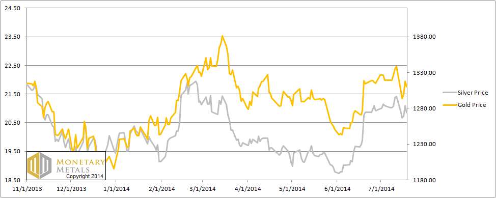
In any case, despite the price action on Thursday, the prices of both metals ended up lower on the week. $28 and 57 cents, respectively.
Readers are wondering if this surge on Thursday could possibly be hoarders coming into the market, or if it was just leveraged speculators slamming the buy button. So read on…
First, here is the graph of the metals’ prices.
The Prices of Gold and Silver
We are interested in the changing equilibrium created when some market participants are accumulating hoards and others are dishoarding. Of course, what makes it exciting is that speculators can (temporarily) exaggerate or fight against the trend. The speculators are often acting on rumors, technical analysis, or partial data about flows into or out of one corner of the market. That kind of information can’t tell them whether the globe, on net, hoarding or dishoarding.
One could point out that gold does not, on net, go into or out of anything. Yes, that is true. But it can come out of hoards and into carry trades. That is what we study. The gold basis tells us about this dynamic.
Conventional techniques for analyzing supply and demand are inapplicable to gold and silver, because the monetary metals have such high inventories. In normal commodities, inventories divided by annual production can be measured in months. The world just does not keep much inventory in wheat or oil.
With gold and silver, stocks to flows is measured in decades. Every ounce of those massive stockpiles is potential supply. Everyone on the planet is potential demand. At the right price. Looking at incremental changes in mine output or electronic manufacturing is not helpful to predict the future prices of the metals. For an introduction and guide to our concepts and theory, click here.
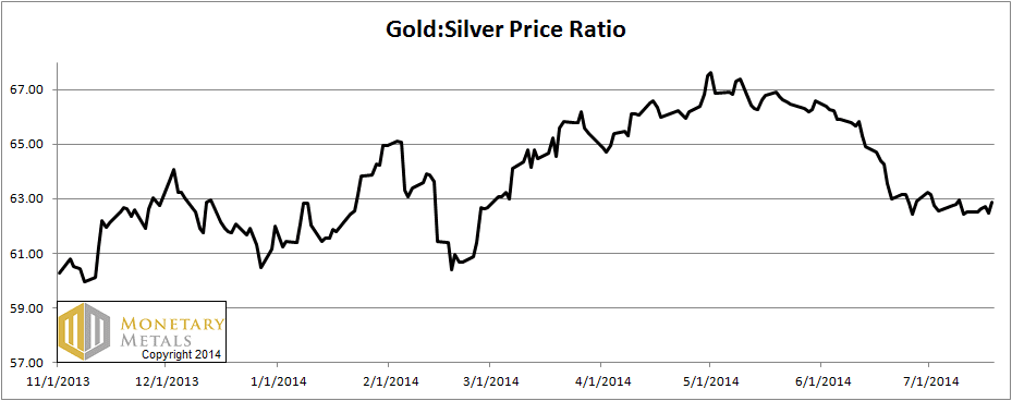
Next, this is a graph of the gold price measured in silver, otherwise known as the gold to silver ratio. The ratio moved up slightly this week.
The Ratio of the Gold Price to the Silver Price
For each metal, we will look at a graph of the basis and cobasis overlaid with the price of the dollar in terms of the respective metal. It will make it easier to provide terse commentary. The dollar will be represented in green, the basis in blue and cobasis in red.
Here is the gold graph.
The Gold Basis and Cobasis and the Dollar Price
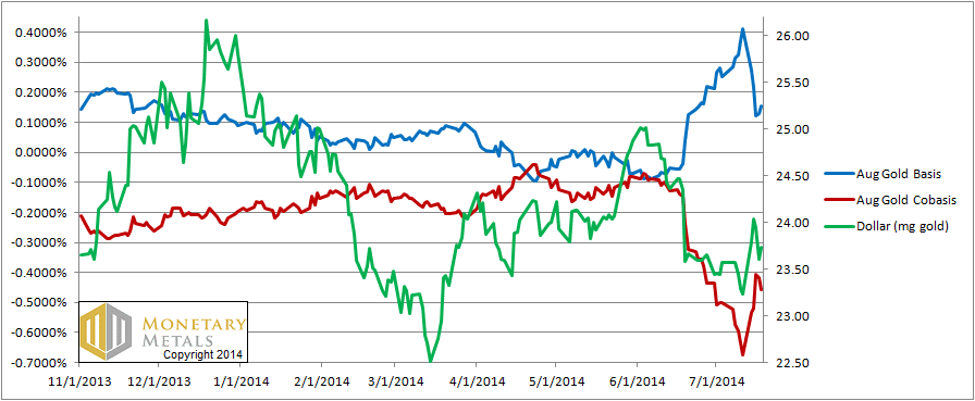
The carry in August gold absolutely collapsed, with smaller declines in the carry for October and December.
What really stands out on this chart is the almost perfect correlation between the cobasis and the dollar price. This is why we plot the cobasis, and don’t just infer everything from the basis. Since mid-June, they have moved together in tandem. What does this mean?
It means that every price tick has been due to speculators repositioning themselves. When they sell gold (i.e. the dollar goes higher), as they did Mon, Tue, and Fri this week, it becomes scarcer. This has been selling of futures, relative to physical metal. When they buy gold (i.e. the dollar goes lower), gold becomes less scarce. That happened from mid-June and on Thu this week.
The picture could not be any clearer if we hired a window washing service to put squeegee to glass.
Now let’s look at silver.
The Silver Basis and Cobasis and the Dollar Price
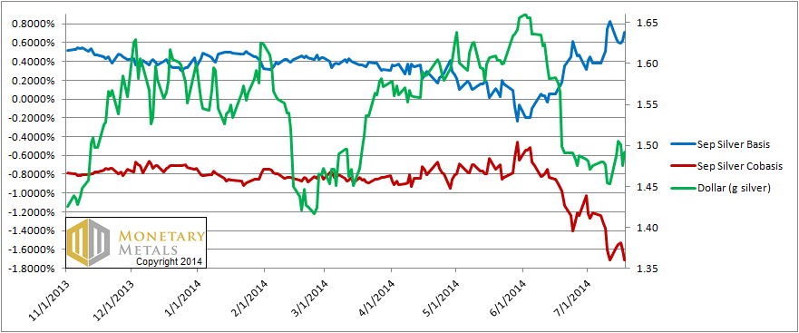
A similar pattern exists in silver. The fall in the dollar price measured in silver began at the same time the dollar price in gold began falling, at the beginning of June. There are two notable differences on this graph.
One is that in gold, the cobasis held up pretty well before dropping a few weeks later. But in silver, the cobasis began falling step for step with the dollar. The other is that the silver cobasis barely ticked higher when the dollar was bought against silver (i.e. silver was sold).
The September silver cobasis is at its all-time low. Compare to the August gold cobasis, which is not. It’s also at a much lower level in absolute terms.
The story persists that silver will outperform gold or even “blast off”. Like the will o’ the wisp, this story is not going to lead you to a happy, healthy place.
© 2014 Monetary Metals
Looking at the 12 month forward GOFO rate of 17 basis points it seems amazing to me that anyone would consider selling physical for an annual return of .17%
Isn’t this longer term view more representative of the hoarding in the gold market vs the supposed “risk free” rate on the 10yr of 2.5% ?
Are you able to tell me if 17 basis on the 12 month forward is normal relative to history ?