Crude Oil Supply and Demand
We don’t normally analyze the crude oil market. However, there has been a huge price move (which may not be complete yet). With the endless rumors of deals that explain the move, we thought we would look at the spreads. The data shows a startling picture.
You should approach supply and demand in this market similarly to gold and silver. The difference is that there is very little inventory buffered in the system. Notwithstanding what you read about China “buying up” the oil to take advantage of “cheap” prices, oil requires specialized storage facilities. There is a significant cost to store it, and finite capacity too.
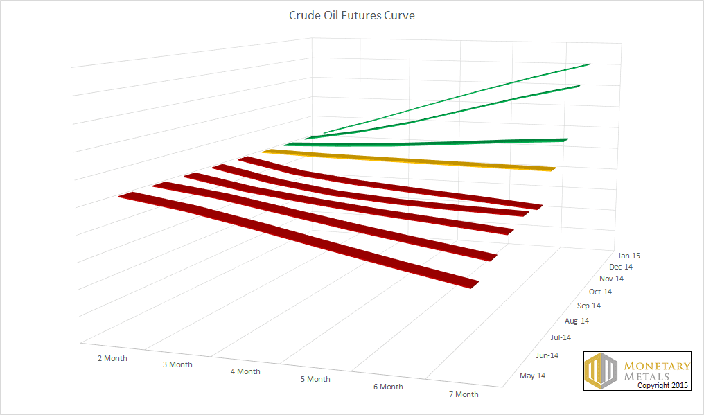
Below is a 3D graph of the futures curve taken at various times, from before the crash through January 9. Each line represents the curve at a given moment. Red lines are where there is backwardation. Yellow is a flat curve. And green indicates contango. Unlike our regular Supply and Demand Report for gold and silver, this shows just the price of various futures contracts and does not compare to the spot price. So here, backwardation is when a farther-out contract is cheaper than a nearer one. Contango is when the nearer one is cheaper. As with the monetary metals, backwardation is a sign of shortage, and contango is a sign of adequate or abundant supply.
You can see backwardation from May through September, with a gradual lessening of the slope. What really stands out is that, abruptly, the backwardation disappeared.
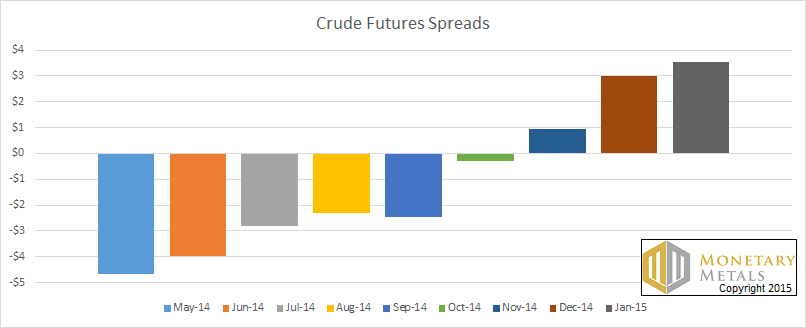
Here is another graph, showing the total spread included in each future curve (measured in dollars per barrel).
In May, there was nearly a $5 premium of the near contact over the distant contract. Now, there is over a $3 premium for the distant one. That is a picture of a market in shortage turning into a market without a shortage.
Contango is normal. It costs to store oil, and so if you want someone to deliver it to you 7 months out, you will have to pay him to cover this cost plus a profit. Otherwise why should he do that for you? When you buy a futures contract, that is what you are ordering—storage and delivery on a date.
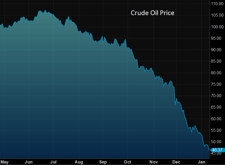
Here is a graph of the price. The correlation to the changing spread is obvious.
The price of oil peaked in June, and began falling thereafter. The drop picked up a little speed in August but the plunge didn’t begin until October. That happens to be when the shortage subsided.
A trend is clear in the spring and summer, and it accelerated in the fall. Either supply increased or demand decreased. We leave it to oil experts to say which, and why.
© 2015 Monetary Metals


Keith, you might want to re-do the graphs; the years show 2014, not 15.
Never mind, I re-read it.
Keith, the first 3D graph looks great, it’s a very interesting way to picture the future contracts. I wonder if you could do it for the metals contracts also?
Thanks, great work!