Last week, we discussed the ongoing fall of dividend, and especially earnings, yields. This Report is not a stock letter, and we make no stock market predictions. We talk about this phenomenon to make a different point. The discount rate has fallen to a very low level indeed.
Discount in stocks is how you assess the present-day value of earnings to occur in the future. For example, if the discount rate is 10%, then a dollar of earnings per share at Acme Piping next year is worth $0.90 today. At a 1% discount, it’s worth $0.99. As you look forward many years, the difference between these rates is very large.
A buck of earnings at 10% discount = $1.00 + $0.90 + $0.81 + $0.73 … = $10.
At 1% discount = $1.00 + $0.99 + $0.98 + $0.97 … = $100.
A rising stock price is equivalent to a falling discount rate, assuming earnings are not growing commensurately. Our graph last week shows that they aren’t.
The idea of commensurate is important in economics. Any economist can paint a rosy picture by, for example, showing rising GDP. If you object that debt is rising with GDP, the economist switches to a chart of debt/GDP. He will tell you that the solution is to grow GDP with the right fiscal and regulatory policies.
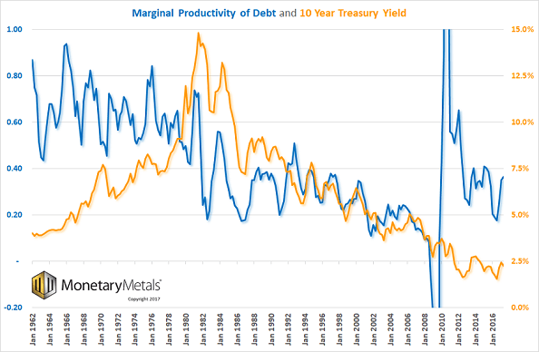
However, we can look at how much additional GDP is added for each newly-borrowed dollar. This is called marginal productivity of debt. This shows a clear picture, a secular decline over many decades. To produce this graph, take change in GDP divided by change in debt.

Source: St Louis Fed
Several salient features stand out. One is the volatility in the early years of the series. Without digging deeper into this, we suspect this is at least partly due to errors in how the data is gathered.
Two, the oscillations are the Federal Reserve’s business cycle! There is a peak every few years. If you picture a bureaucrat moving levers to control the economy, trying to boost at times, but not overcompensate, that’s not far off the mark.
Three, this is a long-term falling trend. Everyone has seen graphs showing GDP growing. In fact, GDP is now 50 times greater than it was 65 years ago, at the start of the graph in 1947. However, debt has also been growing. GDP is not growing commensurately with debt. It is underperforming. Just a little bit each year, but over time it is profound.
Up until around 1981 (an important date, as this is when the rising interest rate turned to falling—more on that below), the peaks were well over 70 cents of growth for every dollar borrowed. This is not good, by the way—it should be over a dollar. But it’s a damned sight better than what happened after that.
From 1981 through just prior to the global financial crisis, marginal productivity of debt fell from over 70 cents to under a dime. A freshly borrowed dollar added less than 10 cents to the economy (by the way, we think GDP is a flawed measure of the economy, in the same way that the amount someone eats is a flawed measure of his wealth). Less than 10 cents on the dollar of borrowed money went into all the things included in GDP. That means that more than 90 cents went into something else.
Four, post-crisis, the number had some wild oscillations, before coming back to Earth in 2012. GDP fell from an annualized $14.8 trillion in Q3 2008 to $14.3 trillion in Q2 2009. After that, GDP began rising. However, the debt lagged. Debt hit a high of $54.6 trillion in Q1 2009, then fell to a low of $53.8 in Q2 2010, before resuming its rise. A total of $800 billion went out of existence.
Five, marginal productivity of debt appears to be at a higher level than it was pre-crisis. Part of the explanation may be changes in how the Bureau of Economic Analysis measures GDP. For example, in 2013 BEA announced that it would begin including film royalties and research and development. However, we suspect the majority of the change can be attributed to one factor: the consumption of capital.
GDP is worse than useless as a measure, because it makes no distinction between spending your income, and spending your liquidated savings. Or spending someone else’s borrowed cash. This matters when the Fed incentivizes a great conversion of one party’s wealth into another’s income (see Keith’s Yield Purchasing Power discussion for more about this idea).
In 1981, a period of 34 years of rising interest rates came to an end. Interest began to fall. Each time the rate drops, it offers a greater incentive to borrow, and hence add to GDP. However, it also does something else. It increases the burden of those who borrowed previously. This is because the net present value of all future payments must be discounted by the current market interest rate. The rate at which the debtor borrowed is not a factor. Thus, the lower the rate, the higher the net present value.
Falling interest rates have little impact on short-term bills. The real magic occurs on the long bond. A 10-year bond goes up a lot more than a 1-year (a 30-year bond would go up even more, but we will look at the 10, being more common).
The gain of the holder of an asset (including a bond or loan) is matched by the loss of the issuer. A change in interest rates is a zero-sum transfer of wealth. It is not entrepreneurial creation of wealth. However, as they say, every dollar spends the same. No one makes a distinction between dollars made from labor, rent, profit—or speculation.
The drop in interest rates has two effects. The debtors become less inclined (and less able) to spend. And the asset owners, particularly those who finance their assets with short-term debt, are happy to spend more.
So which of these opposing trends prevails? Let’s look at a long-term chart of marginal productivity of debt overlaid with interest on the 10-year Treasury bond.

There appears to be no correlation during the period of rising interest rates. But starting in 1981, the change from rising to falling interest ushered in a new regime. After that point, not only do the two lines correlate, but even the zigs and zags match. It’s uncanny.
Let’s introduce one more new idea, and we will tie it all together. Marginal productivity of debt is called marginal, because it looks at what is happening with the borrowed dollar right on the line between viable and nonviable. Marginal is one of the key concepts of the Austrian School discovered by Carl Menger (and also by Stanley Jevons and Leon Walras, unknown to each other at the time).
Change occurs at the margin. For example, when the sales tax is hiked by 1%, there are TV interviews of people shopping in a mall. It’s pure propaganda. They show an affluent family buying an X-Box for their teenage son, saying the tax won’t change their buying behavior at all. Of course not! That wealthy video-game-buying family is not the marginal consumer! They should go to Walmart and ask the single mother of 3 kids, buying mittens for the youngest, if the tax means a more meager Christmas!
It is the same with interest rates. The interest rate had been rising when Steve Jobs secured a loan of $250,000 in 1977, to get Apple Computer off the ground. Apple was not the marginal business, and this was not the marginal loan. It would not have mattered much if the Treasury rate was 7.4% or 10% (Apple paid more than the Treasury rate, of course). However, the borrower at the margin is the one who finds himself unable to borrow at the higher rate.
The 1960’s and 1970’s was a period of destruction of heavy industry. Low-margin manufacturers could not justify borrowing to refresh their plant. So when it went end-of-life, they had to shut down (or move elsewhere where rates were lower or subsidized).
The same analysis works when interest is falling. It is not who will stop borrowing as the rate goes up, but who will start borrowing or borrow more as it falls? What is the use of credit at the margin at 6% and what new uses will be found for credit at 3%?
It should be obvious that the lower the rate, the less productive the credit. Back at the time Apple was founded, you had to have a highly productive business to justify borrowing. Today, interest on the 10-year Treasury is about 70% lower than it was in 1977. For business borrowers, the change as a percentage is larger.
This brings us back to the question of why does the marginal productivity of debt show a big increase after the crisis? As we said above, it may be partially due to changes in how GDP is measured (and if GDP can be over-reported, debt could be under-reported too). Another factor may be consumption of capital by speculators who own rising assets, and those whose incomes are tied to asset prices (e.g. CEOs, bankers, brokers, etc.) A third factor may be the extraordinary deficits of the government. These are all unsustainable trends. We believe there is something else.
We will leave the question of what causes the higher level after 2010 open for now, and encourage readers to contact us with their thoughts on this. One thing is for sure, the relationship between falling interest and falling marginal productivity of debt did not come to an end in 2010. We are therefore not inclined to trust the graph after that date.
The prices of the metals shot up, by $28 and $0.57.
Last week, we said:
One way to think of these moves is as the addition of energy into the market. Like tossing a pebble into a still pond (not quantity of water, but energy that perturbs it). Once the speculators get the idea that gold and especially silver should go up, well it becomes self-fulfilling. Statements by the Fed, the ECB, or even the fatboy who rules North Korea can all have an effect.
That described this week perfectly, especially Friday morning. The Consumer Price Index came in below the Fed’s target. It was up 1.7%, below the 1.8% expected and 2% Fed policy. This news ignited a 20-cent increase in the price of silver within minutes.
We have to take a moment to savor the irony. Suppose the economy is underperforming Fed targets. And therefore the Fed will do more of what it had been doing, during which time the prices of gold and silver had been falling. But this time—so the theory goes—the increase in the quantity of dollars will cause the prices of the metals to go up.
In our view, the trend will continue: falling interest, rising debt, falling marginal productivity of debt… and the prices of the metals will one day skyrocket for some reason. But today is not that day, and Fed policy to increase quantity of dollars is not that reason.
In our view, these data releases are not important, just noise.
We will look at an updated picture of the fundamentals of supply and demand of both metals. But first, here are the charts of the prices of gold and silver, and the gold-silver ratio.

Next, this is a graph of the gold price measured in silver, otherwise known as the gold to silver ratio. The ratio fell.
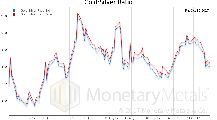
In this graph, we show both bid and offer prices for the gold-silver ratio. If you were to sell gold on the bid and buy silver at the ask, that is the lower bid price. Conversely, if you sold silver on the bid and bought gold at the offer, that is the higher offer price.
For each metal, we will look at a graph of the basis and cobasis overlaid with the price of the dollar in terms of the respective metal. It will make it easier to provide brief commentary. The dollar will be represented in green, the basis in blue and cobasis in red.
Here is the graph showing the gold basis and cobasis overlaid with the price of the dollar (inverse to the price of gold, measured in dollars).

The basis (i.e. abundance) is up and cobasis (i.e. scarcity) is down a bit. Which is what you’d expect if speculators pushed up the price of futures with leveraged bets. The price of spot is pulled up by the arbitragers, but trails the price of futures.
Our calculated Monetary Metals gold fundamental price is up, but not so much as the market price. Six bucks.
Now let’s look at silver.

The same pattern occurs in silver. The metal is more abundant at the higher price.
Our calculated Monetary Metals silver fundamental price is also up, 32 cents.
© 2017 Monetary Metals

I’ll bite and play Piñata on this question about rates:
“We wonder where, on a line that has been falling for 36 years, is the normal point?”
It looks like a tale of two durations right now. The short term rates for LIBOR, and the 3 months to 2 year treasury yields are at the higest since late 2008.
https://www.investing.com/rates-bonds/u.s.-1-year-bond-yield
The highest rates in 9 years on some durations. Nine years is like going from 1st grade to Driver’s Ed, it’s not that short. I don’t think we should dismiss the highest short term rates in 9 years as trivial, especially if we are giving advice to buy treasury bonds and call options on treasury futures:
https://youtu.be/WzA3UJ2k1zk?t=47m46s
I agree that central banks exist only to allow governments and associated cronies to borrow more, at lower rates than otherwise would be possible. They are also however not very smart.
There is a real risk coming up here that they lose control of the bond market. Particularly after they (Fed, ECB, BOJ) have absorbed so much of the issuance and telegraphed when they intend to stop purchasing (ECB announcement coming tomorrow), and in case of the US fed, when they will start selling. Notable that the latter was supposed to start October 1 and the balance sheet is still growing:
http://www.businessinsider.com/curious-things-are-happening-on-the-feds-balance-sheet-2017-10
If long government bonds were a risk free bet on a capital gain when central banks were buying, won’t there be front running in terms of shorting / selling bonds when central banks telegraph their intentions to sell?
Likely they will just revert back to QE, but on what time frame and how much damage can be done between the two inflection points? If the entire global bond market swings like Portugal’s bonds did, from 3.7% to 16.4% in under 2 years it can set off a financial crisis orders of magnitude greater than 2008.
To quote from your same AIER video: https://youtu.be/WzA3UJ2k1zk?t=55m32s
“In 1913… They set in motion a non-linear system, dynamic characterized by positive feedback loops and resonance. Think of the collapse of the Tacoma Narrows Bridge, so that’s what they set in motion. Interest rates begin to rise and then crash through the depression and then begin to rise in 1947-1981. Each time the amplitude is greater than the time before. Until eventually the steel is torn apart and the whole thing dumps into the drink.”
We can’t fully dismiss a large global bond market collapse (ie. skyrocketing yields) occuring before the central banks ramp up the counterfiting and attempt to drive interest rates into a black hole.
Also since about late 2012 the “market” has been “pricing in” a gradual return to a more historically normal monetary policy. What happens to the dollar or gold if that expectation is suddenly flip on its head with another massive QE program?