
Monetary Metals Supply and Demand Report: 3 August, 2014
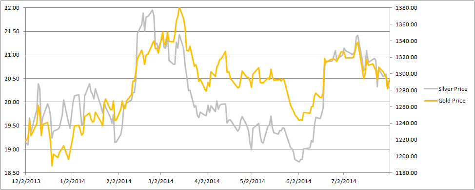
The dollar prices of the metals fell this week. Gold closed last Friday trading at $1307 but closed this week at $1293. Silver was $20.70 last week and is now $20.31.
Ron Paul said this week that gold could go to infinity. Keith’s commentary on this is published on Forbes.
To see the picture of the supply and demand fundamentals, read on…
First, here is the graph of the metals’ prices.
The Prices of Gold and Silver
We are interested in the changing equilibrium created when some market participants are accumulating hoards and others are dishoarding. Of course, what makes it exciting is that speculators can (temporarily) exaggerate or fight against the trend. The speculators are often acting on rumors, technical analysis, or partial data about flows into or out of one corner of the market. That kind of information can’t tell them whether the globe, on net, hoarding or dishoarding.
One could point out that gold does not, on net, go into or out of anything. Yes, that is true. But it can come out of hoards and into carry trades. That is what we study. The gold basis tells us about this dynamic.
Conventional techniques for analyzing supply and demand are inapplicable to gold and silver, because the monetary metals have such high inventories. In normal commodities, inventories divided by annual production can be measured in months. The world just does not keep much inventory in wheat or oil.
With gold and silver, stocks to flows is measured in decades. Every ounce of those massive stockpiles is potential supply. Everyone on the planet is potential demand. At the right price. Looking at incremental changes in mine output or electronic manufacturing is not helpful to predict the future prices of the metals. For an introduction and guide to our concepts and theory, click here.
Next, this is a graph of the gold price measured in silver, otherwise known as the gold to silver ratio.
The Ratio of the Gold Price to the Silver Price
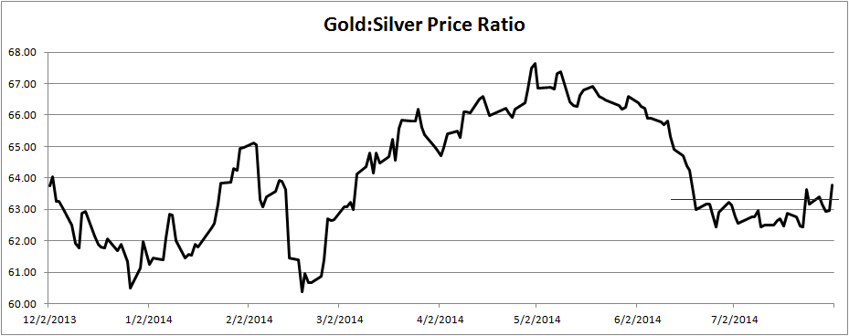
We show a line above the recent trading range. We don’t normally discuss technical analysis in this Report, but we would say that the ratio looks like it has broken out of the range. We thought it might be interesting to look at a longer history of this ratio.
Michael Oliver, of Momentum Structural Analysis, provides the following two charts and commentary. The first is a picture of the ratio going back to the last peak of the ratio—over 80!—in fall 2008. MSA has drawn lines to show a channel for the rising trend.
The Long-Term Ratio of the Gold Price to the Silver Price
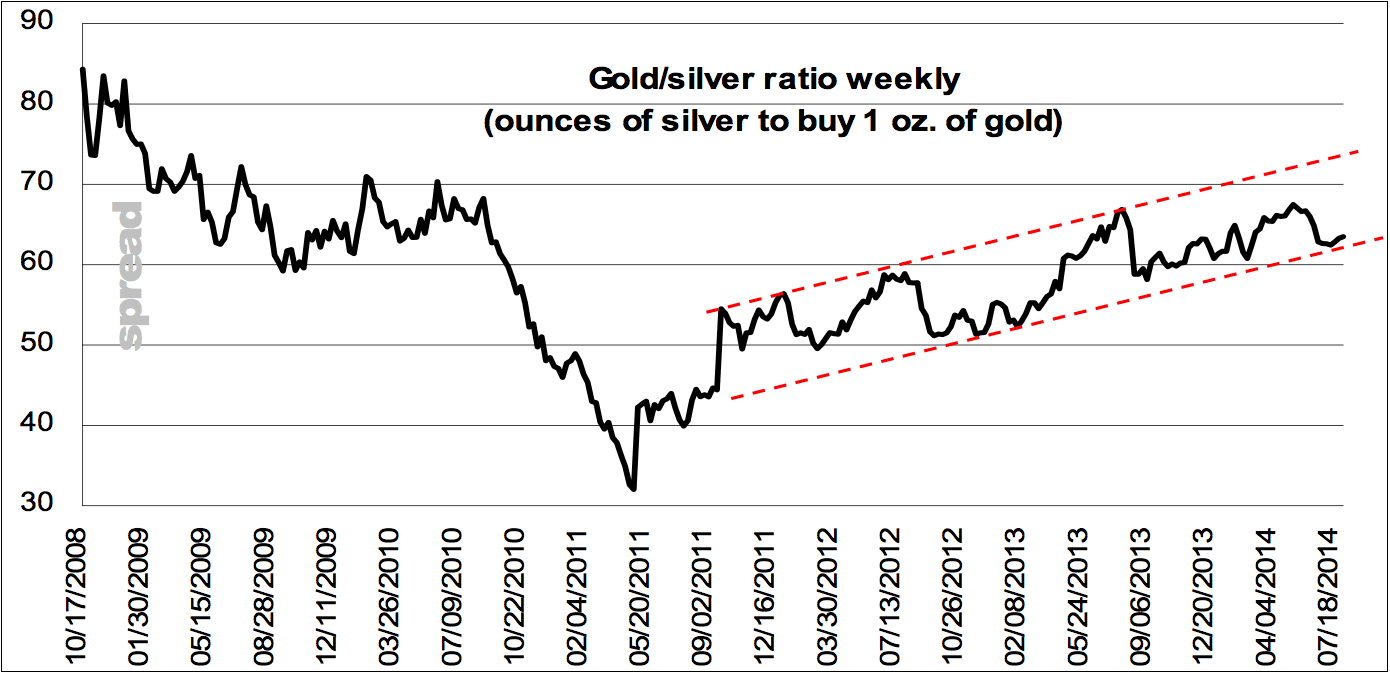
Trend channel on the spread chart remains intact, though recent low certainly served to define the bottom-end of that projected parallel channel. A weekly close near 61 will be ample breakage of the support structure and trend. Indicating at that point a firming by silver in relation to gold (something that usually accompanies positive net trend in the two metals’ prices).
MSA refers to the gold-silver ratio using the term spread. Next, here is the MSA chart of the momentum of the ratio. Think of momentum as the change in price, like speed is a change in distance. You may still be headed east, but you can slow down.
The Momentum of the Ratio of the Gold Price to the Silver Price
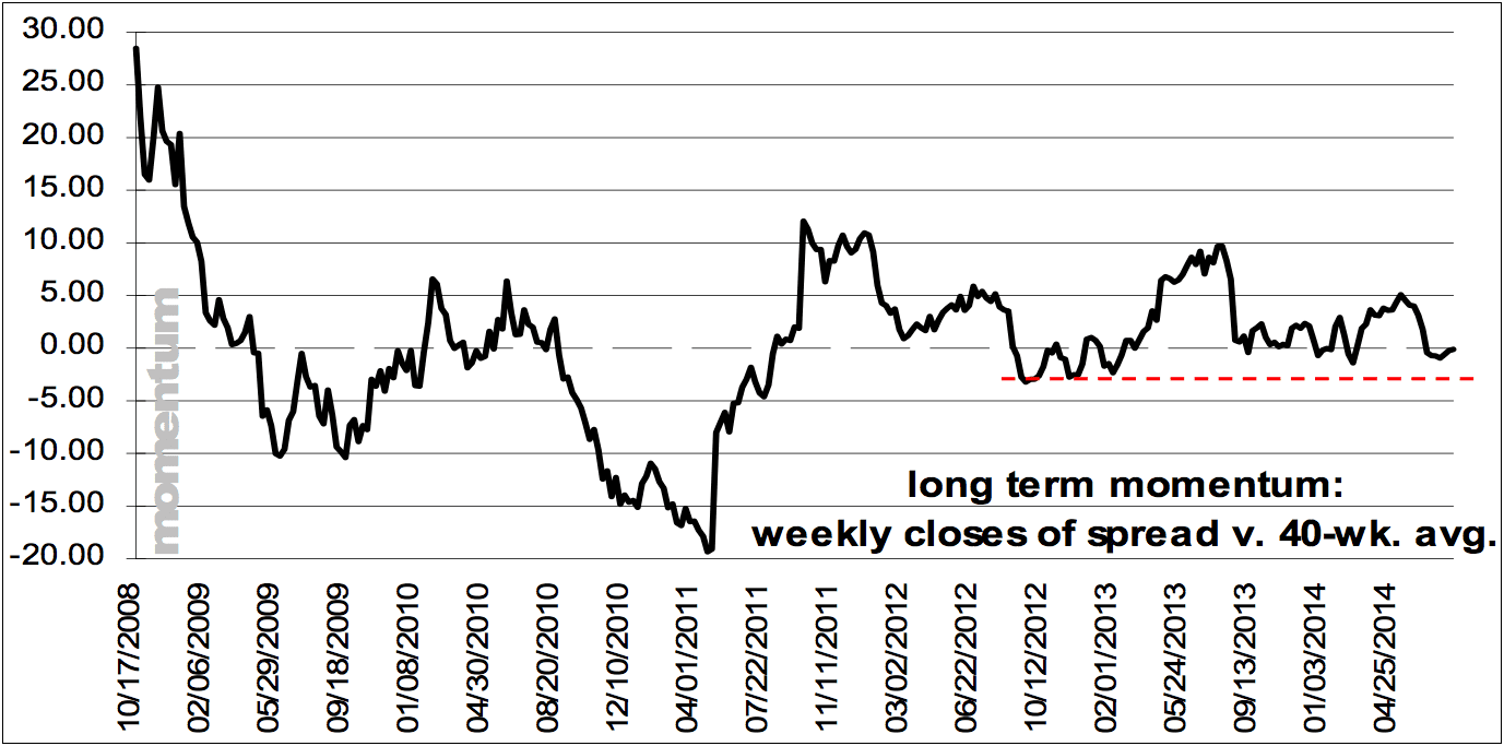
Momentum also curled its toes up without breaking its version of key structural support. If the spread were to weaken to near 60 then lows as defined by the horizontal line would come out – all reaction low readings of past 3 years. Currently the spread is at 63.5.
On our screen, the ratio closed the week at 63.77.
For each metal, we will look at a graph of the basis and cobasis overlaid with the price of the dollar in terms of the respective metal. It will make it easier to provide terse commentary. The dollar will be represented in green, the basis in blue and cobasis in red.
Here is the gold graph.
The Gold Basis and Cobasis and the Dollar Price
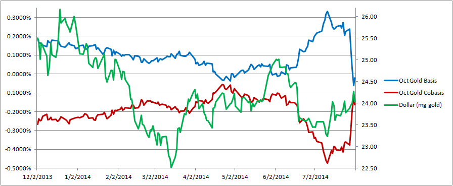
There is still that strong correlation between the cobasis and the dollar price, though it looks to our eyes like the cobasis rose proportionally more than the dollar.
At the moment, price moves are largely speculators shifting about. When they sell gold futures (i.e. the dollar goes higher, gold becomes scarcer. When they buy gold futures (i.e. the dollar goes lower), gold becomes less scarce.
The speculators are trying to front-run hoarders, but hoarding demand is not materializing on cue.
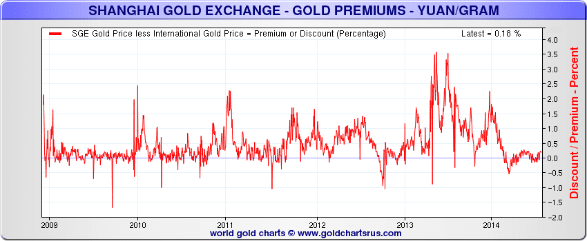
Speaking of which, we saw this very interesting chart from Sharelynx. Remember the story about gold moving from West to East? As water always flows from higher elevation to lower, gold moves from lower price to higher. If Asia bids higher than the West asks, then someone will buy West and sell East. This arbitrage will compress the price spread.
In looking at this chart, this trade looks like it lasted about a year, 2013.
The Gold Premium in Shanghai
Now let’s look at silver.
The Silver Basis and Cobasis and the Dollar Price
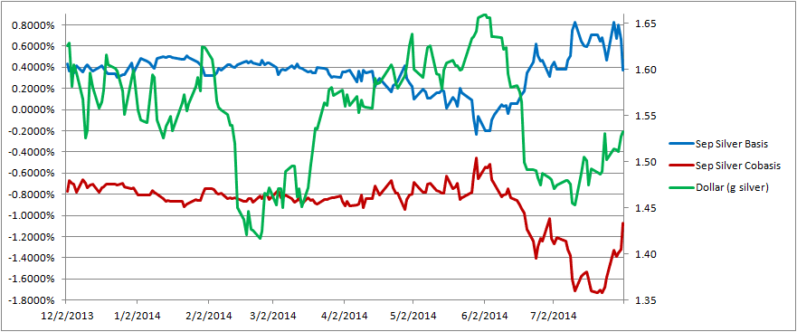
In silver, the cobasis rose this week along with the dollar (i.e. with the drop in the silver price). As with gold, speculators repositioning themselves are causing these moves.
© 2014 Monetary Metals
Well, if I read the Silver chart correctly, if the correlation between the Green (price) line and the red (cobasis) line holds good and the corrective trend continues, then we should see cobasis around -0.7% and the price around 1.58 grammes – which is sub $20
I am not at all confident about the prospects for Silver between now and the end of the year
Keith,
Great post this week. Very interesting charts – as always exceptional analysis of the metals