
Monetary Metals Supply and Demand Report: 1 June, 2014
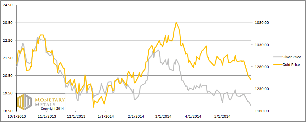
This week was a shortened week due to Memorial Day on Monday, but those four days must have seemed eternity for silver speculators. The gold price dropped all week, but the $30 out of $41 of the fall occurred on Tuesday. The silver price dropped 40 cents on Tuesday and 17 cents on Friday, down 66 cents.
As always, we are interested in the fundamentals of supply and demand. Read on…
First, here is the graph of the metals’ prices.
The Prices of Gold and Silver
We are interested in the changing equilibrium created when some market participants are accumulating hoards and others are dishoarding. Of course, what makes it exciting is that speculators can (temporarily) exaggerate or fight against the trend. The speculators are often acting on rumors, technical analysis, or partial data about flows into or out of one corner of the market. That kind of information can’t tell them whether the globe, on net, hoarding or dishoarding.
One could point out that gold does not, on net, go into or out of anything. Yes, that is true. But it can come out of hoards and into carry trades. That is what we study. The gold basis tells us about this dynamic.
Conventional techniques for analyzing supply and demand are inapplicable to gold and silver, because the monetary metals have such high inventories. In normal commodities, inventories divided by annual production can be measured in months. The world just does not keep much inventory in wheat or oil.
With gold and silver, stocks to flows is measured in decades. Every ounce of those massive stockpiles is potential supply. Everyone on the planet is potential demand. At the right price. Looking at incremental changes in mine output or electronic manufacturing is not helpful to predict the future prices of the metals. For an introduction and guide to our concepts and theory, click here.
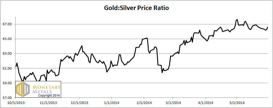
Next, this is a graph of the gold price measured in silver, otherwise known as the gold to silver ratio. The ratio moved up a bit this week.
The Ratio of the Gold Price to the Silver Price
For each metal, we will look at a graph of the basis and cobasis overlaid with the price of the dollar in terms of the respective metal. It will make it easier to provide terse commentary. The dollar will be represented in green, the basis in blue and cobasis in red.
Here is the gold graph.
The Gold Basis and Cobasis and the Dollar Price
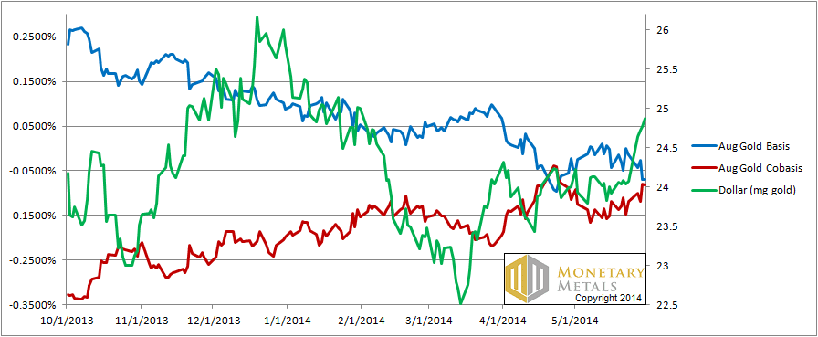
The price of the dollar has been rising since March. It’s now up to almost 25mg, from 23.5. The gold cobasis (think of that red line as a measure of scarcity) has been lazy, at best, in rising along with it.
Gold is not much more scarce at its current price than when it was $130 higher. Maybe this is due to falling demand from India or maybe it is due to rising sales from central banks. Or the cause could be something else. The data shows us the net result, though.
Now let’s look at silver.
The Silver Basis and Cobasis and the Dollar Price
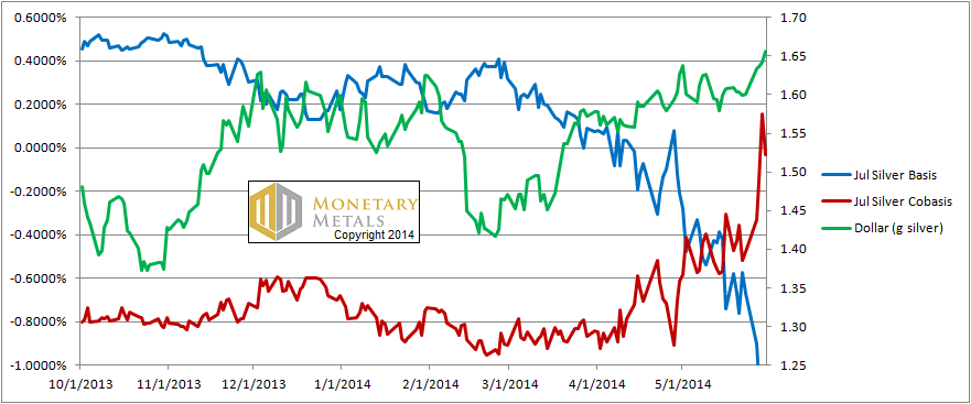
The silver cobasis (think of it as a measure of scarcity) rose all week, with the price of the dollar measured in silver. Unlike in gold, the cobasis does not look lazy. In fact on Thursday, we had backwardation in the July silver contract.
That backwardation subsided on Friday, which is notable because the silver price was dropping. We will have to wait to see what happens with the cobasis this week.
Now let’s take a look at a graph of the gold basis and cobasis curves going out a few years.
The Gold Basis and Cobasis Curve
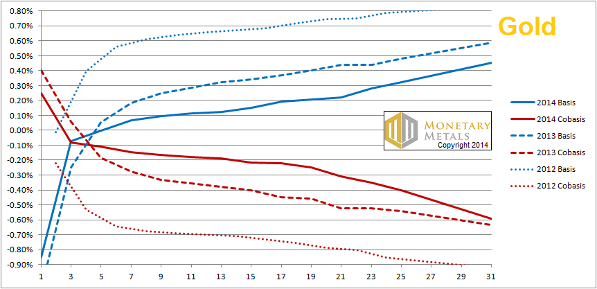
The bottom axis is labeled with contract months. 1 means June, i.e. 1 month from now. December is 7, and so on.
The solid blue and red lines are the basis and cobasis on Friday. We can see a nice rising basis and falling cobasis, going out to December 2016. The dashed lines represent a snapshot from last year, and the dotted lines are from 2012.
There are a few salient features.
First is that there’s no backwardation anywhere. Whatever we may say about relative scarcity, the cobasis is negative for all contracts and smoothly falling as we go farther out in time.
Second is that the basis, though positive, is de minimis. There is little or no incentive to carry gold—i.e. to buy metal and sell a future. Who wants to lock up their capital for 7 months to get 10 basis points, or for over a year and a half for 20 basis points?
Third, last year the basis was higher and cobasis lower. The year before, the basis was higher still, and cobasis lower still. We have a multiyear trend of falling basis (abundance) and rising cobasis (scarcity).
I regard this to be a more serious sign of rot than the intermittent temporary backwardation seen so far. Though it appears quiescent at the moment, I don’t believe it’s benign. The closer to zero the cobasis is, the less it would take to set off a firestorm of backwardation. Let’s put this in perspective. The cobasis out to Dec 2015 is around -0.2%. Granted, this is not an apples to apples comparison, but the July silver cobasis rose more than that on Tue and Wed this week alone.
Backwardation creeping out a few years will be a serious thing.
One other thing is worth mentioning. The gold price has been falling. Last year at this time, it was just under $1400. In 2012, of course it was much higher than that. You would expect rising scarcity as the price falls, and that is precisely what the data shows.
Now here is the equivalent graph for silver.
The Silver Basis and Cobasis Curve
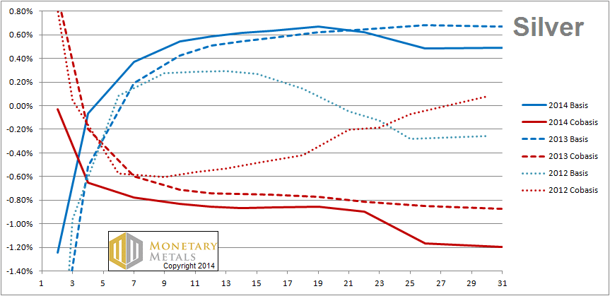
The multiyear trend in silver is the opposite that in gold. We now have a higher basis and lower cobasis than we did last year, and last year had the same change from 2012. Indeed in 2012, we had the last vestige of a long-term silver backwardation that was still fading.
The silver price was $22.70—just about four bucks higher—last year. And in 2012, it was many dollars higher than that.
The silver price has dropped like Wile E Coyote kicked off the cliff’s edge by the Road Runner, and yet silver has become more abundant.
One other thing is worth noting, once we get into 2016, we see both the basis and cobasis drop. This is a widening of the bid-ask spread. Silver is less liquid now than it was last year or the year before.
© 2014 Monetary Metals
awesome Keith, thanks for providing the long term perspective.
Simply brilliant commentary
The multi-year chart begs for extensive analysis. For instance 2012’s trades in 2014 contracts seemed to signal fears of a coming scarcity of trade-able gold. Indeed each year offers up a unique structure in the 2-year futures spread. Just fascinating, and hard to express in laymans’ terms. Keep at this work, Keith – your insights are without rivals in the gold blogosphere.
Hi Keith,
How far back can you chart the multi-year Basis/CoBasis trends for gold & silver? It would be interesting to see the changes from 2000; especially leading up to, and after, 2008.
Thank you,
Jeff