Silver Futures Market Assistance, Report 12 Feb, 2017
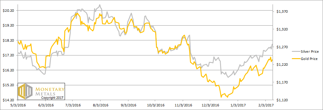
This week, the prices of the metals moved up on Monday. Then the gold price went sideways for the rest of the week, but the silver price jumped on Friday. Is this the rocket ship to $50? Will Trump’s stimulus plan push up the price of silver? Or just push silver speculators to push up the price, at their own expense, again?
This will again be a brief Report this week, as we are busy working on something new and big. And Keith is on the road, in New York and Miami.
Below, we will show the only true picture of the gold and silver supply and demand fundamentals. But first, the price and ratio charts.
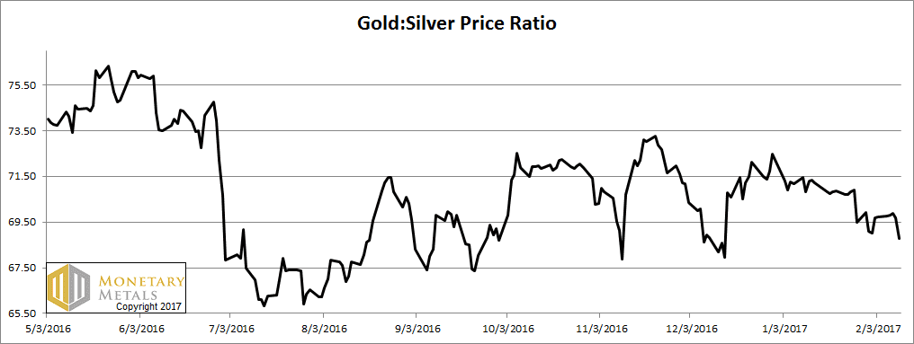
Next, this is a graph of the gold price measured in silver, otherwise known as the gold to silver ratio. It fell this week.
The Ratio of the Gold Price to the Silver Price
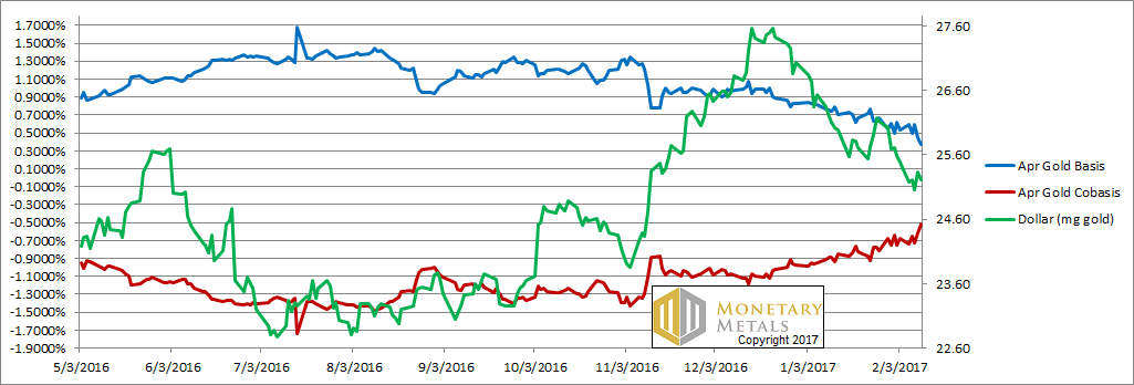
For each metal, we will look at a graph of the basis and cobasis overlaid with the price of the dollar in terms of the respective metal. It will make it easier to provide brief commentary. The dollar will be represented in green, the basis in blue and cobasis in red.
Here is the gold graph.
The Gold Basis and Cobasis and the Dollar Price
Again, we see a higher price of gold (shown here in its true form, a lower price of the dollar) along with greater scarcity (i.e. cobasis, the red line).
This pattern continues. What does it mean?
First, it means the price of gold is being pushed up by buyers of physical metal. Not by buyers of futures (which would push up the basis, and reduce scarcity).
Second, if it continues too much more, it means nothing good for the banking system. There is one force that can make all the gold in the world—which mankind has been accumulating for thousands of years—disappear faster than you can say “bank bail in”. The force is fear of counterparties, fear of banks, fear of currencies, fear of central bank balance sheets… fear of government finances.
We want to emphasize that the gold basis is not signaling disaster at the moment. It is merely moving in that direction, for the first time in a long time. It has a ways to go yet.
Our calculated fundamental price is up another $40 (on top of last week’s +$40). It is now about $130 over the market price.
Now let’s look at silver.
The Silver Basis and Cobasis and the Dollar Price
Note: we switched to the May contract, as March was becoming unusable in its approach to expiry.
In silver, the story is a bit less compelling. The scarcity of the metal is holding, as the price rises. However, scarcity is not increasing.
Were we to take a guess, we would say there is some good demand for physical, and the price action had futures market assistance.
While the market price moved up 44 cents, our calculated fundamental price moved up … 46 cents.
© 2016 Monetary Metals


Hi Keith,
still following your market commentary with interest.
Would adding stocks of warehouse registered gold/silver add to the picture? The amount of silver has halved over the last couple of years. Does the stock not serve to absorb market shocks? Will new registered stock appear when needed? Interesting to see stocks fall dramatically with a falling price in 2015 (or maybe not)? Also what about lease rates, what do they mean and how do they impact?
Many thanks,
MetalsD
http://www.24hgold.com/english/interactive_chart.aspx?title=COMEX+WAREHOUSES+REGISTERED+GOLD&etfcode=COMEX+WAREHOUSES+REGISTERED&etfcodecom=GOLD
http://www.24hgold.com/english/interactive_chart.aspx?title=COMEX+WAREHOUSES+REGISTERED+SILVER&etfcode=COMEX+WAREHOUSES+REGISTERED&etfcodecom=SILVER
In general Comex warehouse stocks are like ETF holdings – they go up and down with the gold price, indicating buying and hoarding by investors and selling when the price falls. To be useful one has to look at the change in stock in conjunction with changes in open interest, however it should be kept in mind that warehouse stocks are a figure that can be manipulated (see Martin Armstrong’s comments on moving inventory between New York and London here http://goldchat.blogspot.com.au/2012/02/martin-armstrong-on-metals-manipulation.html).
The charts you link to don’t go back very far. The other factor to look at is the change in how the market uses eligible and registered. In this post http://research.perthmint.com.au/2015/07/06/historic-comex-stocks-open-interest-and-delivery-figures/ there is a chart of eligible and registered back to the mid-90s. You can see that registered has declined but eligible is pretty much in a continuous up trend. I think the decline in amount of registered is a result of the ease today with which market makers can transfer from eligible to registered (see http://research.perthmint.com.au/2016/01/06/issuers-can-make-deliveries-using-eligible/) and them not wanting to signal to the market their positioning coming up (and during) delivery month.
Thanks for taking the time to reply, I appreciate it. What you say is very interesting, I’ll follow your links and read more.
Many thanks,
MetalsD