
Stocks, Bonds, Euro, and Gold Go Up, Report 4 June, 2017
The jobs report was disappointing. The prices of gold, and even more so silver, took off. In three hours, they gained $18 and 39 cents. Before we try to read into the connection, it is worth pausing to consider how another market responded. We don’t often discuss the stock market (and we have not been calling for an imminent stock market collapse as many others have).
The initial reaction in the US equities market (futures, as this was before the opening bell) was down. But it was muted, and then in a few hours turned around and the market ended even higher.
Each stock represents a business. Presumably, if jobs growth was disappointing then this is bad for stocks on two grounds. One is that companies hire based on their revenue expectations. Slow or no hiring means slow or no revenue growth. The other is that people who aren’t hired don’t buy as much, and so there is a feedback loop into sluggish business revenue growth.
However, the stock market disagreed. It said let’s cut the earnings yield a bit more, from 3.94% to 3.93%. This presumably means that earnings are set to take off (or it could mean that everyone from wage-earners who pour their surplus into the stock market to older speculators are not thinking about earnings yield).
Not only did the stock market go up, so did the euro. As did US Treasury bonds. And, finally, gold and silver. What is the one thing that these all have in common?
It is possible to borrow to buy these assets.
We read this as a garden-variety day of credit expansion. Folks, this is how the monetary system is supposed to work, according to mainstream economic thought. Based on <insert story du jour>, people borrow to buy assets. This creates a wealth effect, as rising asset prices makes people (at least those who own those assets) feel richer. When they feel richer, they go out to eat more, buy more Rolexes and Porsches, and that employs everyone else. Or so their theory goes.
Stock analysts have a wealth of material to study the fundamentals of public companies. We leave that work to them. We have a theory, model, and now a robust software platform to study and calculate the fundamentals of gold and silver.
We will show charts of the fundamental prices we calculate. But first, a look at the prices of the metals and gold-silver ratio.

Next, this is a graph of the gold price measured in silver, otherwise known as the gold to silver ratio. It moved up a bit, though down on Friday.
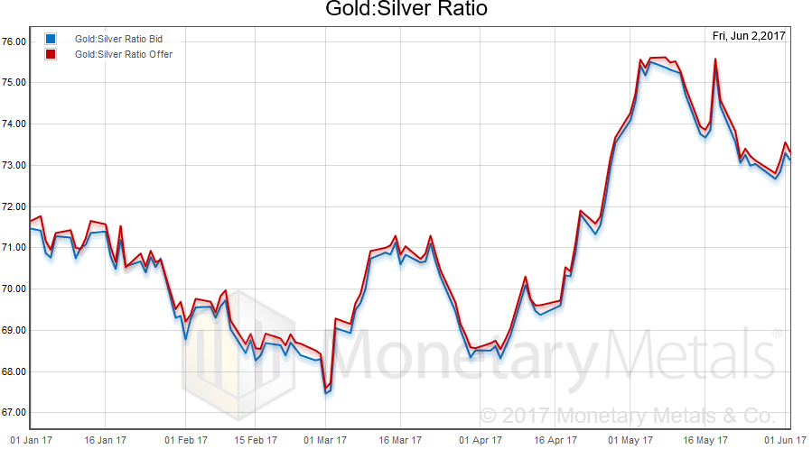
In this graph, we show both bid and offer prices. If you were to sell gold on the bid and buy silver at the ask, that is the lower bid price. Conversely, if you sold silver on the bid and bought gold at the offer, that is the higher offer price.
For each metal, we will look at a graph of the basis and cobasis overlaid with the price of the dollar in terms of the respective metal. It will make it easier to provide brief commentary. The dollar will be represented in green, the basis in blue and cobasis in red.
Here is the gold graph.
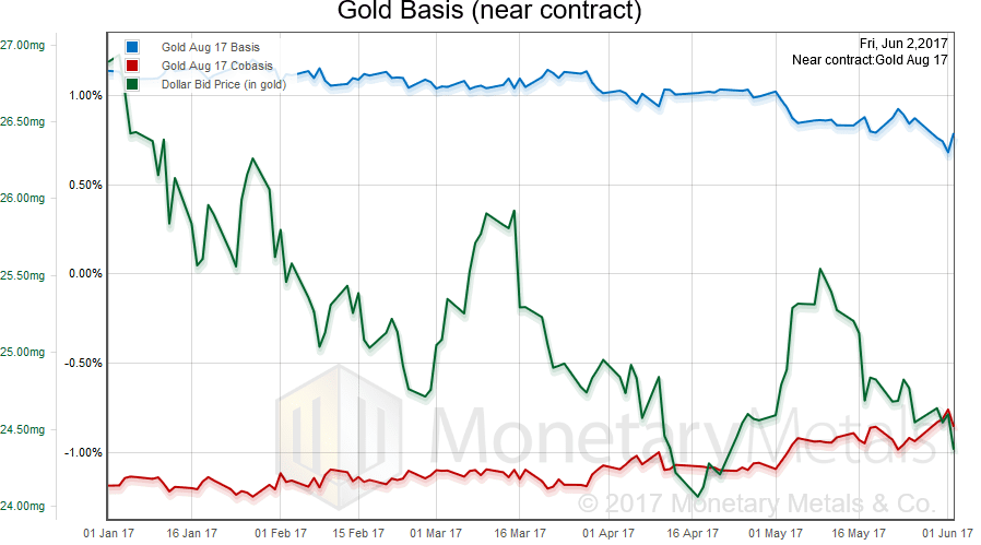
We had a dropping price of the dollar (the mirror image of the rising price of gold), and a slightly falling abundance (the basis) and slightly rising scarcity (the cobasis).
Our old model shows an increase in the gold fundamental price of $19 ($1,267 to $1,286). Our new software also shows an increase, though smaller and at a higher level ($1,330 to $1,334). We plan an article to discuss this difference.
Now let’s look at silver.
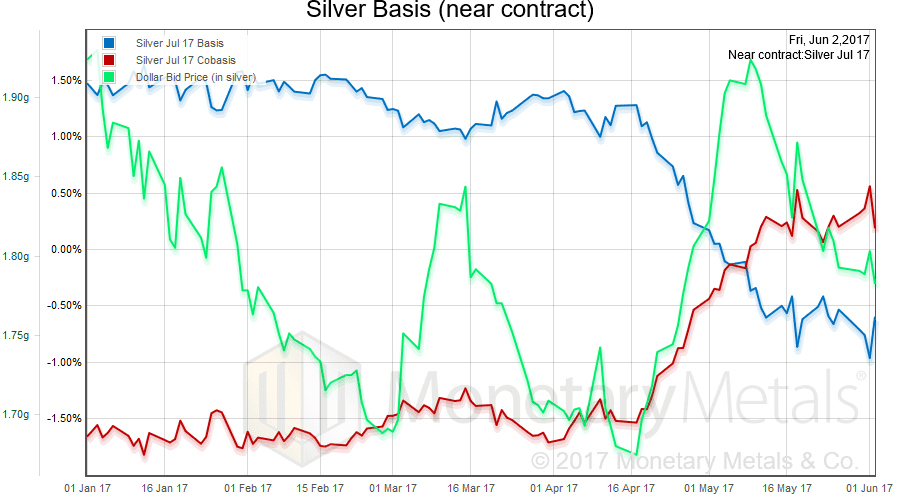
In silver, there is a slight increase in abundance and decrease in scarcity as the price has risen.
Our old model shows an increase in the silver fundamental price of $0.05 ($16.12 to $16.17). Our new software, however, shows a decease and not a small one ($17.97 to $17.62). Here is a graph.
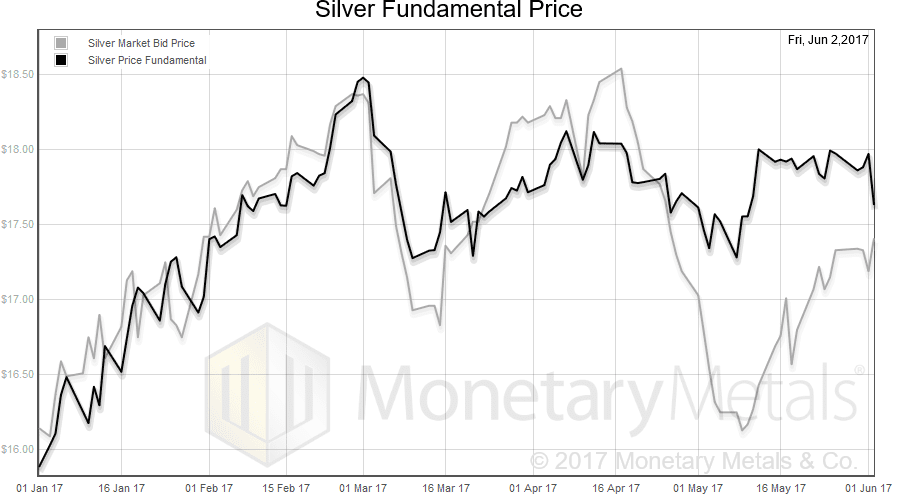
Note that the fundamental price (new software platform) is rangebound from early March. It is considerably less volatile than the market price, which is what we would hope for.
Keith will be in London the week of June 19, and in New York the week of June 26. If you’re interested in attending a Monetary Metals seminar on GOFO and transparency in the gold market in either city, or to meet with Keith to discuss gold investment, please click here.
© 2017 Monetary Metals

I have a question that I wonder if anyone here could help to answer.
If you take the World Gold Council’s figures on supply and demand. You can subtract demand from supply and get an “institutional investment” number. This should represent the amount of gold mined, refined, and sold into the bullion banking system each quarter that was never sold. It’s just sitting there in inventory.
Here’s some recent numbers:
Q1 2016: -154.9
Q2 2016: 94.4
Q3 2016: 209.9
Q4 2016: 42
Q1 2017: -2.6
Now here’s my question. According to Keith’s theory, the “warehousemen” should be accumulating gold when the GOFO rate is high, the basis is high, or the market price is above the fundamental price.
I’ve looked at all of the charts on this site, and it’s clear that something really strange WAS going on in Q2/Q3 of last year.
The implied gold lease rate had risen to 0.8-1.0% at the end of Q1. But it spent the entire second quarter falling all the way down to -0.1 to -0.2%. Then it went back up to 0.4 to 0.5% by the end of the third quarter.
The GOFO rate also rose in the second quarter, from 0.25% to 1.5%. But then flattened out in the third quarter.
In addition, the fundamental/market price spread went from a $100 discount to around a $140 premium in Q2, but then fell to zero during Q3.
Nevertheless, I don’t see any obvious connection between institutional investment and any of these charts. The bullion banks for some reason seem to have been accumulating A LOT of gold in the second and third quarters. But all of the charts were going one way in Q2 and the opposite way in Q3.
Does anyone have an idea as to why this may have occurred?
I’m inclined to think that they were just buying for some other reason…because their clients wanted gold, because they had open gold leases they couldn’t fulfill, because a bunch of clients wanted to allocate their accounts and take delivery, etc.
But I can’t get over the nagging feeling that there really is some connection I’m missing.
The flow of bullion into and out of the UK correlates with bull and bear markets. After several years of gold leaving London, there was a dramatic shift in March 2016.
Monthly net imports to the UK (my calculation) were 145mt March, 196mt April, 126mt May, 147mt June, 151mt July, 171mt August, 174mt September, 59mt October. This turnaround was achieved at the expense of flows to the so-called “east” where price sensitive buyers backed away following the significant rise in Q1.
These UK imports were consistent with higher western demand, e.g. rising ETF holdings in Q1/Q2 (a proxy for overall investment demand) which then peaked mid-year when the price peaked, possibly explaining your noted differences Q2 vs. Q3.
Buying in the east finally recovered in Q4 as prices fell and, as ETF holdings declined, the UK swung back to a net exporter in Dec 2016, 135mt.
Thanks for the info, Brent.
It makes sense that London would see high inflows at the same time that the bullion banks were building inventory…since it’s the global capital of the BB system. That’s interesting.
However, when you say “These UK imports were consistent with higher western demand, e.g. rising ETF holdings in Q1/Q2 (a proxy for overall investment demand) which then peaked mid-year when the price peaked, possibly explaining your noted differences Q2 vs. Q3.”…this can’t be right. Because ETF demand actually peaked in Q1, Not mid-year.
Here’s the data for ETFs (in tonnes):
Q1: 363.7
Q2: 236.8
Q3: 145.6
Q4: -193.1
In fact, every category of investment demand other than “inventory build/bb and exchange hoarding” went down in Q2. And in Q3, the only other category that went up was central bank sales…which had a measly 4.8 tonne increase.
Basically, the price should have fallen. But it went up anyway because …even though other categories fell, the BBs increased inventory more than the fall in the others.
This kept gold out of the hands of jewelry and technology buyers who otherwise would have driven down the price.
What you are saying does kind of make sense though. Maybe they were building inventory, not because of increased ETF demand, but because of the EXPECTATION that there would continue to be steady demand in the future.
Maybe they just figured they’d stock up while the price was low.
Of course, as we all know, that didn’t work out too well for them when ETFs started dumping gold on the market in Q4.
Anyway, I just wondered if there was some other explanation…some arbitrage that would explain it. But I guess it’s just a coincidence that the gold lease rate, GOFO, and premium/discount to fundamental were all going crazy at the exact time that this was happening.
Maybe it’s unrelated.
ETF holdings had been falling for several years after increasing during the bull market. From memory, GLD bottomed in Dec 2015.
ETF holdings in Q1-16 exploded higher with the USD-gold-price rising more than any other quarter for the last 3 decades. While ETF holdings increased by a smaller amount in Q2 this didn’t mean that the gold price should have fallen, it’s just indicative of falling momentum.
GLD holdings kept increasing until early July 2016 and made a double top in early August I think. This suggested that formerly increasing investment demand was beginning to stall in Q3, at the same time as demand in the east hadn’t yet recovered to 2015 levels.
Brent, the price should have fallen in Q2 because the miners were producing more gold, and without ETF demand staying as high as it did in Q1, this meant there was more gold hitting the market than before.
This excess gold should have been sold off at a discount to jewelry fabricators and technology producers.
But it didn’t happen because the “balance” went up. So a SMALLER amount of gold got turned into jewelry and technology in Q2.
The balance then went up even faster in Q3. But this time, other forms of investment demand fell faster than the increase in the balance. So slightly more gold was made into jewelry and technology in Q3, and the price went down slightly.
In Q4, the balance fell (but stayed positive) and ETF demand went negative for the first time since 2015. Other forms of investment demand increased, but not nearly enough to make up for the decline in ETFs and the balance.
So ALOT more gold got made into jewelry and technology, and the price crashed.
If this site will allow backlinks, you can check out the data here: http://goldtradingmastery.com/index.php/2017/02/22/2016-in-review/
Note how Keith’s premium-to-fundamental-price peaked near the time that GLD holdings peaked in early July. So we had investor buying seemingly hitting a wall at the same time as eastern demand, which investor buying had displaced in 2016, still in recovery mode. Kudos to Keith’s model, the 2016 peak of the London PM Fix occurred July 6th, according to Kitco data.
Regarding Q2 ETF, Bron would have a better grasp of the figures than I. From memory ETF holdings peaked at around 2600mt near the end of 2012 following a 9-year run 2004-2012. This equates to an average 289mt increase per year.
Annualised, your Q2 number of 236.8mt (947.2mt) is massive and I wouldn’t be surprised if Q2 2016 was one of the best quarters ever for ETF inflows, representative of overall investment demand. In such a scenario I wouldn’t expect the gold price to fall; but I would after ETF holdings peaked in July/Aug and started their decline.
Thanks for some interesting ideas and questions.
Here are a few thoughts:
1. To clarify, the warehouseman doesn’t know or care what the fundamental price is. He is not buying to speculate on price, but to earn a spread.
2. The warehouseman’s accumulation of stocks is not necessarily going to show up as an increase or decrease in institutional demand. We cover this in a bit more detail in our discussion of GOFO and the lease rate: the banks borrow cash, buy gold, sell a future, and lease the metal out. This may or may not result in an increase in the open interest.
3. The challenge with conventional measures of supply and demand is that they either treat the trickle of gold coming from the mines as substantially all of the supply, or else they look at movement of gold from one place to another. Neither approach provides any information about future price moves. We are measuring not physical movement of gold from one place to another, but the change in state of gold from owned to carried.
Not sure one can read much into that WGC demand-supply figure. The WGC and their data provider does the best they can but their figures are far from complete so I wouldn’t consider the difference to be representative of bullion bank warehousing. Hence not much relationship between “institutional investment” and other figures.
Thanks Keith and Bron.
I’ve found that the difference between mining output+net producer hedging and investment demand + balance is correlated with changes in the price.
I call this number the “monetary gold demand deficit”. It’s the amount of gold mined that investors don’t hoard. As a result, it gets made into jewelry and technology.
When this number goes up, the price falls. When it goes down, the price increases.
So I’m sure the WGC data is telling us something useful.
But Keith has a point. It could just be that the “warehousemen” he is talking about are just one group of “institutional investors”. So because the “balance” isn’t broken down into sub-categories, there’s no correlation between any of the indicators on this site and that data.
That makes sense.
Another way to look at the WGC figures is to take mine output less jewellery and tech – that is the amount of gold investors/hoarders have to buy (although there is an argument that part of “jewellery” is actually investment-ish demand, eg in India).
The consumers of that “surplus” are either:
a) speculators – short term price speculators, will sell
b) investors – medium term price speculators, will eventually sell
c) hoarders – long if not never sell, true “monetary demand”
d) warehousers – price netural inventory holders, carry and decarry based on basis, not price
The problem with WGC figures is they don’t really tell us much about how much gold is held by which category. Keith’s fundamental price algorithm attempts to get a read on this.
I’m not sure what you mean by “that is the amount of gold investors/hoarders have to buy”.
Investors are less price sensitive than jewelry buyers. So they don’t have to buy the surplus. The surplus exists BECAUSE they chose to bid it out of the hands of jewelry collectors.
The reason why we know this is because every time the price goes up, jewelry demand decreases. And every time the price goes down, jewelry demand increases. But with investment demand, it’s the exact opposite.
So it’s really the jewelry buyers that have to buy. Or, to be more exact, the miners have to sell to jewelry fabricators at lower prices if the investors won’t buy. Because even though the price is lower, it’s still higher than the cost of production.
But maybe that’s not what you meant by “have to buy”.
As far as your break-down of investment demand is concerned, it would be great if we could have some way to figure out who is more likely to sell in the future and who will hold for the long-term.
The reason it would be great is because then we could predict when investor accumulation is going to slow down or speed up (it hasn’t been negative since 2004, so that’s not much of a factor).
And this would allow us to make reasonable guesses as to the future of the price.
But my question is this: how would we empirically test Keith’s model?
This is why I asked the question originally. I want to find a way to prove or disprove the theory. So I wondered if a rise in institutional investment was correlated with a rise in the basis or some other indicator that Keith is using.
Unfortunately, I couldn’t find any connection. And that’s because I was apparently off on the wrong track.
But I think it’s important to find some way to test the model. Because if it’s true, it could be used to trade gold more profitably…or it could at least give us a deeper understanding of why gold moves the way that it does.
Maybe part of the problem is that I don’t really understand Keith’s model.
For example, you just stated that “speculators” are included in investment demand. But I thought that what Keith meant by “speculators” were buyers of gold futures. By “speculators”, does Keith mean buyers of PHYSICAL gold that plan on selling in the short term?
If so, I have completely misunderstood his theory. And that might explain why I’m on the wrong track.
I was just proposing an inverse way of looking at the data, different side of the coin. I’m not sure investors are less price sensitive – yes they tend to follow the price but I think there is a case that they are far more fickle than jewellery consumers, that is, they show bigger changes in their demand to the same change in price than jewellery consumers. From that way of thinking, one could argue they are the marginal/swing player in price formation.
Regarding speculators, yes they are generally trading paper contracts like futures, but there are also those that buy and sell physical on short time frames.
“how would we empirically test Keith’s model?” – only thing you really need to compare it to is price. I would note that the basis and cobasis charts are not the indicator to test, they are but one input and it is Keith’s (proprietary) fundamental price algorithm that seeks to turn basis into a price predictor. We have a lot more work planned on refining this algorithm, such things are always a work in progress.
In terms of the theory, this gives a good overview https://monetary-metals.com/introduction-to-the-monetary-metals-supply-and-demand-report/
Thanks a lot for the info…