
The Gold Money Supply Correlation Report, 3 Apr, 2016
There were some fireworks this week. Gold went up on Tuesday (it was a shortened week due to Easter Monday), from a low of $1,215 to $1,244 over the day, a move of over 2 percent. Silver moved from $15.02 to $15.44, almost 3 percent. What happened on Tuesday to drive this move down in the dollar? (We always use italics when referring to gold going up or down, because it is really the dollar going down or up).
Janet Yellen happened, that’s what.
Our Federal Reserve Chair spoke to the Economic Club of New York. We won’t parse her words, but we can see what effect they had on the markets. Markets were up. The S&P surged 45 points, well over 2 percent. The British pound was up almost 2 percent. There was speculative mania, if not irrational exuberance, everywhere. Well almost everywhere. Crude oil was down almost 7% for the week.
When Pavlov trained his dogs to salivate at the sound of the dinner bell, he had to actually serve food. It would not have worked without the reward.
Thus, we remain puzzled at the market salivation at prospects of a greater money supply (or what passes for money nowadays, the irredeemable paper dollar). Why do speculators buy gold and silver at every Fed hint of greater money supply to come? Pavlov’s dogs had only the most rudimentary theory. Dinner occurs after that ringing sound. The market has a sophomoric theory. Higher prices will come after that printing sound. At least that’s the hope, which apparently springs eternal.
We thought we would graph the weekly money supply (MZM is Money of Zero Maturity), one of the measures tracked by the St Louis Fed and overlay the price of gold. We started the graph in April 2011, exactly 5 years ago. It happens to be just prior to the peak in the price of gold, but we don’t think we are cherry-picking the date. A five-year data set ought to be enough to show the trend or lack thereof, as we see in money supply growth and gold price growth respectively.
The Price of Gold and Money Supply (MZM)
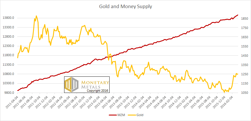
Could these two lines be more different in character (or slope)? Based on seeing this graph, would you borrow money, and lever up to bet on a rise in the price when the Fed promises to keep that straight red line moving straightly?
Well, someone did on Tuesday. Or lots of someones.
Unfortunately for them, they were proven wrong fairly quickly. The price of gold ended the week just about where it started. The price of silver ended down. The gold to silver ratio resumed its northward march.
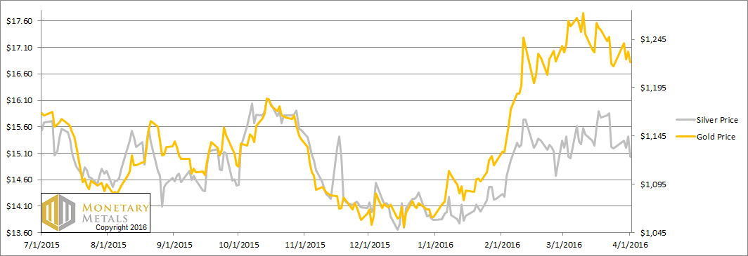
Let’s look at the supply and demand fundamentals. But first, here’s the graph of the metals’ prices.
The Prices of Gold and Silver
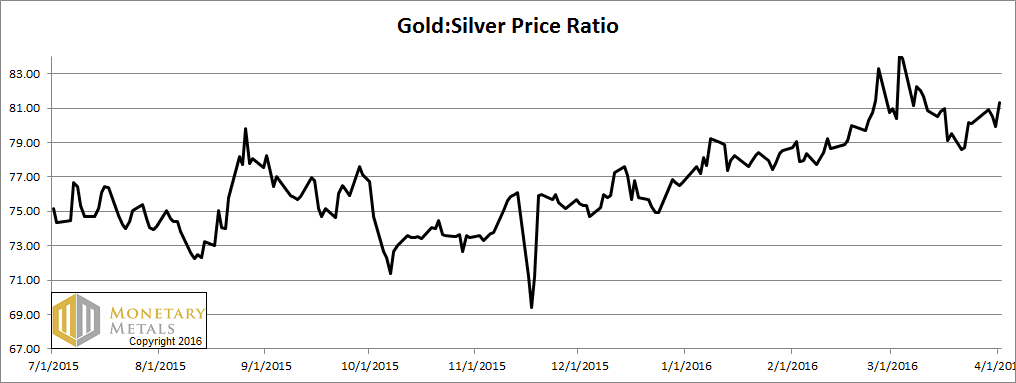
Next, this is a graph of the gold price measured in silver, otherwise known as the gold to silver ratio. The ratio was up this week.
The Ratio of the Gold Price to the Silver Price
For each metal, we will look at a graph of the basis and cobasis overlaid with the price of the dollar in terms of the respective metal. It will make it easier to provide brief commentary. The dollar will be represented in green, the basis in blue and cobasis in red.
Here is the gold graph.
The Gold Basis and Cobasis and the Dollar Price
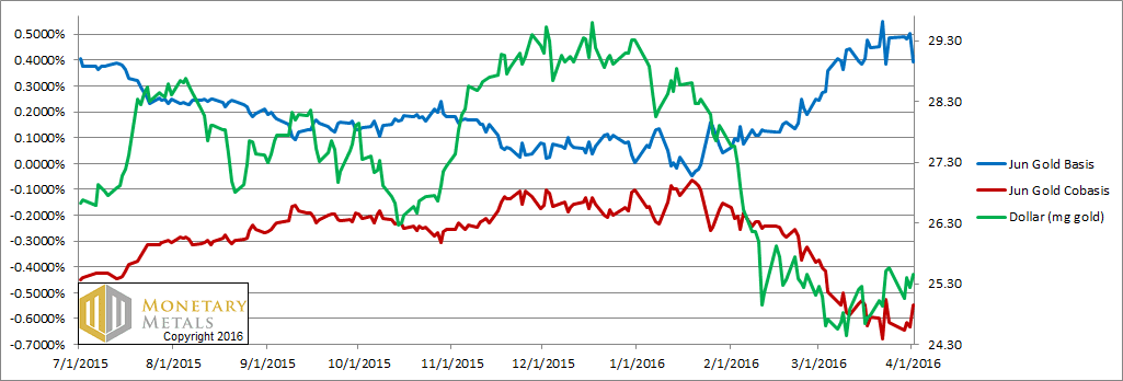
The green line is the price of the dollar, measured in gold terms (i.e. the inverse of the price of gold). The red line is the gold cobasis, our measure of scarcity of the metal. For many weeks, as it fell (i.e. the gold price rose) gold became less scarce. And when it rose, gold became more scarce. There was an almost uncanny tracking of these two lines (which is less pronounced in the June contract).
That relationship deviated last week, and we responded by dropping our fundamental gold price by a hundred bucks.
The fundamentals actually weakened during all that speculative buying on Tuesday, but firmed up later in the week. Our fundamental price ended the week up a few bucks, to just over $1,300. Gold is selling $90 below that, and it’s not a bad buy.
Now let’s look at silver.
The Silver Basis and Cobasis and the Dollar Price
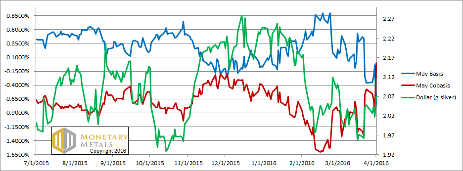
Our scarcity measure, the silver cobasis, continues to show strength when the price of silver drops sufficiently (i.e. the price of the dollar, shown in green) rises. The May cobasis actually ended the week at 0.0000, just on the verge of backwardation. That said, the cobases for farther months are still very negative, and didn’t rise as much proportionally as May. Here’s a graph.
The Change in the Silver Cobasis
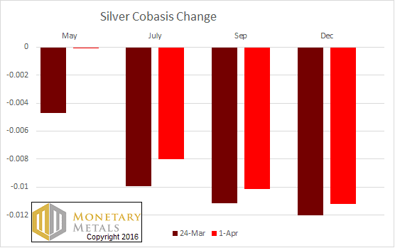
Speculators sold silver off on Friday. And their selling was concentrated in the May contract.
If the May cobasis goes positive this week, it will be a recurrence of temporary backwardation. For years, we documented the tendency of each contract to tip into backwardation as it neared expiry. For silver it tended to happen a bit farther out than for gold. If it happens this week, it will not be particularly early compared to what we saw occur in contract in contract.
We have a silver fundamental around $14.50.
We hope everyone enjoyed the Voldemort Effect, an article we released for April Fool’s Day. It was Bron’s first article since coming on board, and there will be many more.
Make sure to subscribe to our YouTube Channel to check out all our Media Appearances, Podcast Episodes and more!
Additional Resources for Earning Interest on Gold
If you’d like to learn more about how to earn interest on gold with Monetary Metals, check out the following resources:
In this paper we look at how conventional gold holdings stack up to Monetary Metals Investments, which offer a Yield on Gold, Paid in Gold®. We compare retail coins, vault storage, the popular ETF – GLD, and mining stocks against Monetary Metals’ True Gold Leases.
The Case for Gold Yield in Investment Portfolios
Adding gold to a diversified portfolio of assets reduces volatility and increases returns. But how much and what about the ongoing costs? What changes when gold pays a yield? This paper answers those questions using data going back to 1972.
© 2023 Monetary Metals

Okay, I admit it, I have stolen a copy of your Gold and Money Supply graph. It tells the story better than any article that has ever been written.
Thanks Philip!
Please wait until next April Fool’s Day for another Harry Potter inspired report. I’m not into it, so I had no idea what you were talking about. (Also, not into Star Wars either, just a hint.)
Btw, the Fed is primarily in the business of creating credit, not money. So looking at MZM, M1, M2, M etc. is irrelevant. The markets were salivating over the prospects of credit continuing to expand.
Thanks for your feedback. We want to try to use humor and keep the tone light when possible, but always stay focused on the core mission which is quite serious.
Keith,
Maybe you’ve covered it in the past but how do you determine your fundamental prices?
It is a proprietary model.
I’m going to cast a vote in favor of the April Fool’s Day story. I’m not a big Harry Potter fan but did see one movie. I thought the story was a fascinating fantasy look at why the markets have moved the way they have. Great entertainment!
I read just about everything you publish. I don’t always agree but I am always educated by your opinions.
Keith:
Concerning your first chart, relating the price of gold and the money supply, why not do something simple: construct a chart relating the price of gold versus the money supply ( a standard micro supply chart), taking time as just a parameter.
well, i couldn’t resist
http://www.kitco.com/news/2016-03-31/LBMA-Gold-Ounces-Transferred-Daily-Up-Sharply-In-February-Silver-Volume-Lower.html
feel free to check my math. In fact please do so. I came up with, between gold and silver, assuming they are open Monday thru Friday, 161,000,000 ounces per day approximates to:
day $27.3B – 402,500 bars -10,733,333M pounds -5,367 tons
month $546B – 8,050,000 bars -214,666,667M pounds -107,333 tons
year $6,552,000,000,000T – 96,600,000 bars -2,576,000,000B pounds -1,288,000 tons
six point five trillion in turnover at an implied profit (pick whatever you like) of .005 is almost $33 billion a year. Is this on a financial statement somewhere? are they paying tax on it? forget the metals, buy stock in the cartel. are we to believe, between five members and nine lackeys that four hundred thousand bars and fifty three hundred tons are moving around daily? almost a hundred million bars weighing almost one point three million tons are being shipped back and forth among these banks yearly? where are the ships and armored cars? and this is only lbma. the curse of the pm’s: their abundance. I think G Jaxon hit on it. this ceremony is in control of the dollar and the dollar controls everything else. they’ll tank it when and if they ever get ready. if i’ve made a mistake and look like a dolt, i apologize in advance.
5 years on that chart is enough to make the point that the lag between money supply growth and the dollar’s imploding value is “long and variable” (as the saying goes); but it does not make the relationship non-existent. Use a 50- or 100-year chart, and the past few years of anti-correlation will hardly be visible.
(continuing the thought) The relationship is similar to that between a company’s stock (over-)issuance and the stock’s price. A company which is either growing or/and historically popular, can get away with over-issuing its own stock for a long time. Perhaps a very….long…time. Nonetheless, when the stock’s price crashes eventually, it will be seen that, yes, the over-issuance was one of the important factors.
And the much over-issued USD is essentially shares on the Federal Reserve’s assets. Sooner or later, the Fed-Treasury complex will have to re-capitalize by declaring a far higher official price on its gold holdings (moving from the current official $42.22/oz to something more like $4222). The market might anticipate (force) that re-declaration, or the market might follow (lag) it.