Monetary Metals Supply and Demand Report: 29 June, 2014
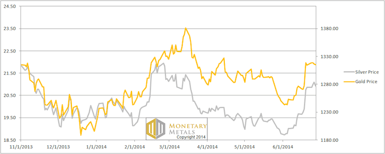
Viewed from our stable perch on a boat tossing in the stormy dollar seas, the lighthouse that is gold went up 1 meter dollar. Silver went up 5 inches cents.
The fireworks of last week did not recur this week.
We will look at how the fundamentals of supply and demand changed this week…
First, here is the graph of the metals’ prices.
We are interested in the changing equilibrium created when some market participants are accumulating hoards and others are dishoarding. Of course, what makes it exciting is that speculators can (temporarily) exaggerate or fight against the trend. The speculators are often acting on rumors, technical analysis, or partial data about flows into or out of one corner of the market. That kind of information can’t tell them whether the globe, on net, hoarding or dishoarding.
One could point out that gold does not, on net, go into or out of anything. Yes, that is true. But it can come out of hoards and into carry trades. That is what we study. The gold basis tells us about this dynamic.
Conventional techniques for analyzing supply and demand are inapplicable to gold and silver, because the monetary metals have such high inventories. In normal commodities, inventories divided by annual production can be measured in months. The world just does not keep much inventory in wheat or oil.
With gold and silver, stocks to flows is measured in decades. Every ounce of those massive stockpiles is potential supply. Everyone on the planet is potential demand. At the right price. Looking at incremental changes in mine output or electronic manufacturing is not helpful to predict the future prices of the metals. For an introduction and guide to our concepts and theory, click here.
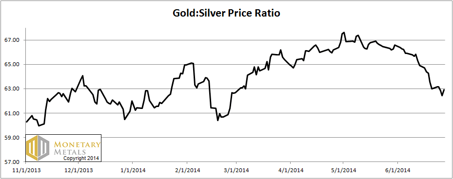
Next, this is a graph of the gold price measured in silver, otherwise known as the gold to silver ratio. The ratio moved down again this week.
The Ratio of the Gold Price to the Silver Price
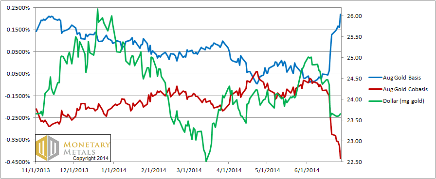
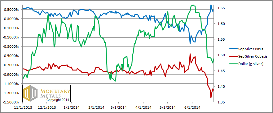
For each metal, we will look at a graph of the basis and cobasis overlaid with the price of the dollar in terms of the respective metal. It will make it easier to provide terse commentary. The dollar will be represented in green, the basis in blue and cobasis in red.
Here is the gold graph.
The Gold Basis and Cobasis and the Dollar Price
Spectacular! Though we suspect this is not what the gold bugs wanted to see. The positive carry in gold has started to return (though less in farther contract months). One can now make 22 basis points annualized to carry gold (i.e. buying a bar of metal and selling a future against it). The cobasis continued its collapse, now down below -43 basis points.
Now let’s look at silver.
The Silver Basis and Cobasis and the Dollar Price
It’s the same picture in silver: rising basis and falling cobasis. The difference from gold is the absolute level. For September, one could carry silver and earn 47 basis points (annualized). The cobasis is below -124 basis points.
Last week, we said that the price could move up higher in the short term. The chart looks bullish and that alone may be a siren song, luring more mariners speculators to sail into the rocks bet on silver with leverage. This week, the price ended up a whole 5 cents higher than it was last week.
The counterbalance to the inrush of speculative money is the decreased demand for real metal and/or increased supply coming to market. What is the proof of this assertion? The fact that the basis rose and the cobasis fell is the proof.
Silver is looking increasingly likely to drop a few meters dollars.
© 2014 Monetary Metals


Wow – I’ve been reading these posts on and off for a while now, and I’ve got to say, that you’ve finally perfected your art of saying absolutely nothing intelligible in a post and completely failing to reach any conclusion whatsoever…
thanks
You gotta go back and read past posts where Keith patiently explains his analytical framework.
You’ve got it right James. It takes time to understand these reports. They aren’t typical of other analyst reports, but they’re very good – the best I’ve seen in my six years of following the metals.
Silver is looking increasingly likely to drop a few meters dollars.
I think that’s a pretty clear statement
Graham, I think one needs to read Keith’s stuff more carefully. Like a math book, not a novel.
I’ve been following silver for many years, and THIS is almost the only report/post that actually does say anything intelligible. You just need to understand it. Almost all other blogs are nonsense.
I agree with grahamn-Alex
Thank you for the amazing report!!! Your analysis is so helpful for silver and gold investors.
I also appreciate the humor of this update. :) I certainly have crashed myself into rocks several times. This website is the lighthouse in a dark, stormy sea of precious metals investing.
Spectacular is right!
Thanks for the comments.
grahamn: We publish some material on how to understand the Report here:
https://monetary-metals.com/introduction-to-the-monetary-metals-supply-and-demand-report/
I wish I had found the lighthouse (this site) before my crash.
Intellectual spot on analysis….. and a sense of humor. Can’t get much better than that.